
A Journey of Reflection and Evolution
"Art is a one-way journey. Design is a return trip." Pepe Cruz Novillo
A follower of AgoraChain once mentioned that he often invested in projects simply because he liked the symbol that accompanied them. While it may seem irrational to overlook objectives, whitepapers, projects, teams, etc., it's not so strange outside the cryptocurrency world, as 95% of purchases are made unconsciously. Whether driven by emotions, feelings, or other factors, we are more irrational than we think...
What is a symbol and what is its purpose?
Today, the word "symbol" has been overshadowed by "logo," though "logotype" technically refers to the textual part of the brand. Professionals like me prefer to call it a "symbol."
Symbols have been a fundamental part of human civilization since its inception, simplifying and synthesizing ideas for communication. Every element of nature, every living being, and every object has a semantic value and meaning that has evolved over time and culture. Even basic aspects like numbers, colors, and shapes carry different values and representations throughout history.
In the blockchain ecosystem, the sheer number of new symbols we see daily is astonishing, often in very small sizes, like a favicon, and frequently alongside competitors. This highlights the importance of having a symbol that is adaptable to small formats and distinct from other projects. We have selected the top 50 tokens on Coinmarketcap for analysis, but the number of projects and consequently new brands is rapidly growing.
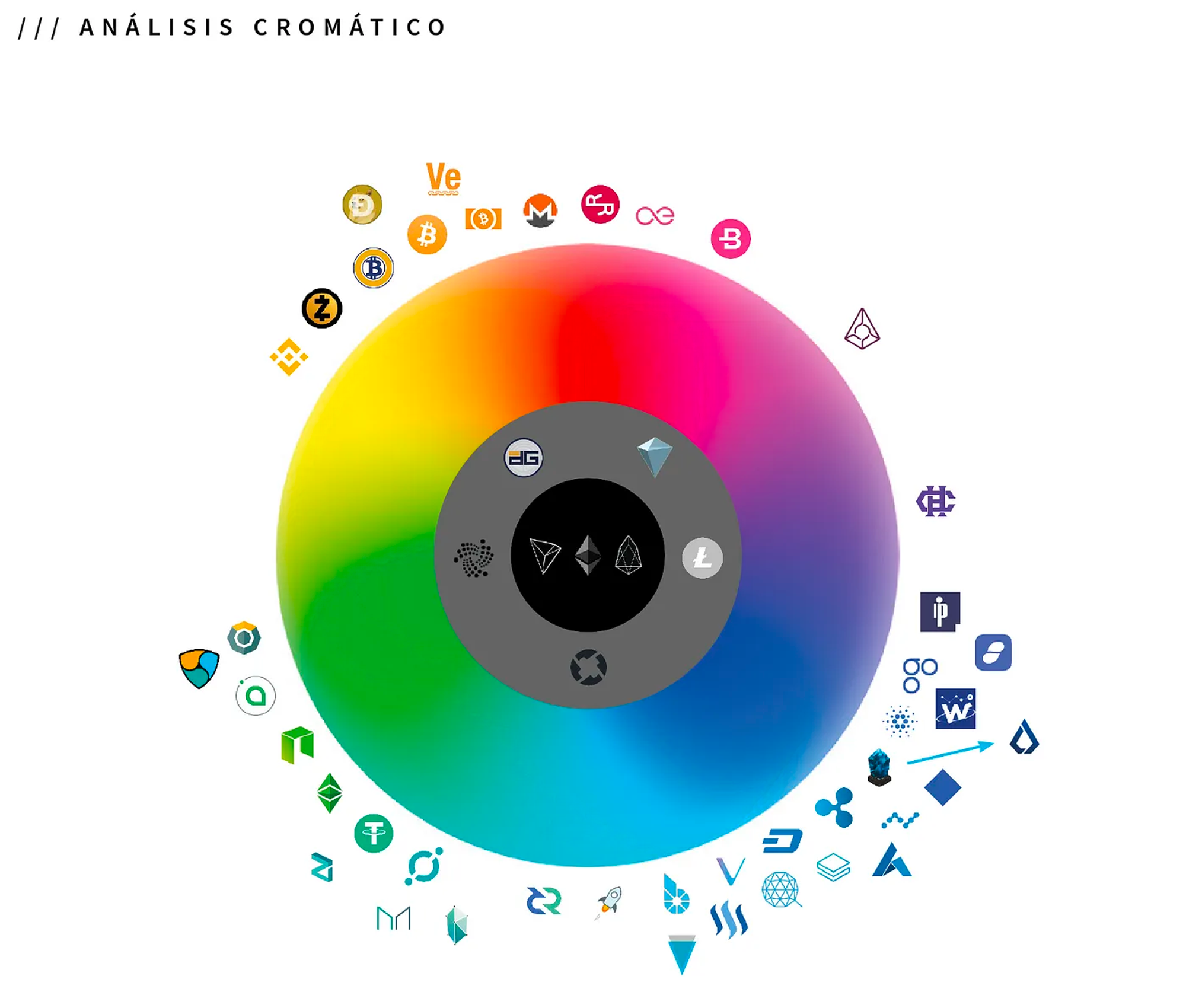
The Color of Symbols
One of the first factors we analyze is color. As you may know, color is attributed various properties and sensations. The color theory is one of the first steps after creating the shape of the symbol, directly related to the sector and the companies within it. In the case of cryptocurrencies, we can categorize them mainly into four color groups: Blues, Greens, Orange-Yellows, and Grays. The majority lean towards the security and tranquility offered by blue. Greens represent hope, ecology, and sustainability, followed by orange-yellows for joy and happiness, and finally blacks and grays for solidity and sophistication.
We also notice a lack of purple, violet, pink, and red hues in these projects. Is it due to the dreaded red candles? Jokes aside, the majority in the top 50 of Coinmarketcap prefer cooler over neutral or warm colors, with over 62% using blue or green.
But why choose only one color?

The Shapes and Their Function
The next analysis focuses on the shape of the symbol, for which we've created four classifications: Letters, Circular, Polygonal, and Figurative. Shapes suggest moods, perceptions, and meanings.
Remembering the digital transformation in social media and avatar images, brands have had to adapt, making circular adaptations of symbols necessary. Within the blockchain ecosystem, this evolution is already considered, with many symbols designed around the perfect circular shape. It's interesting to note how Bitcoin, the pioneer in this category, has always opted for this shape.
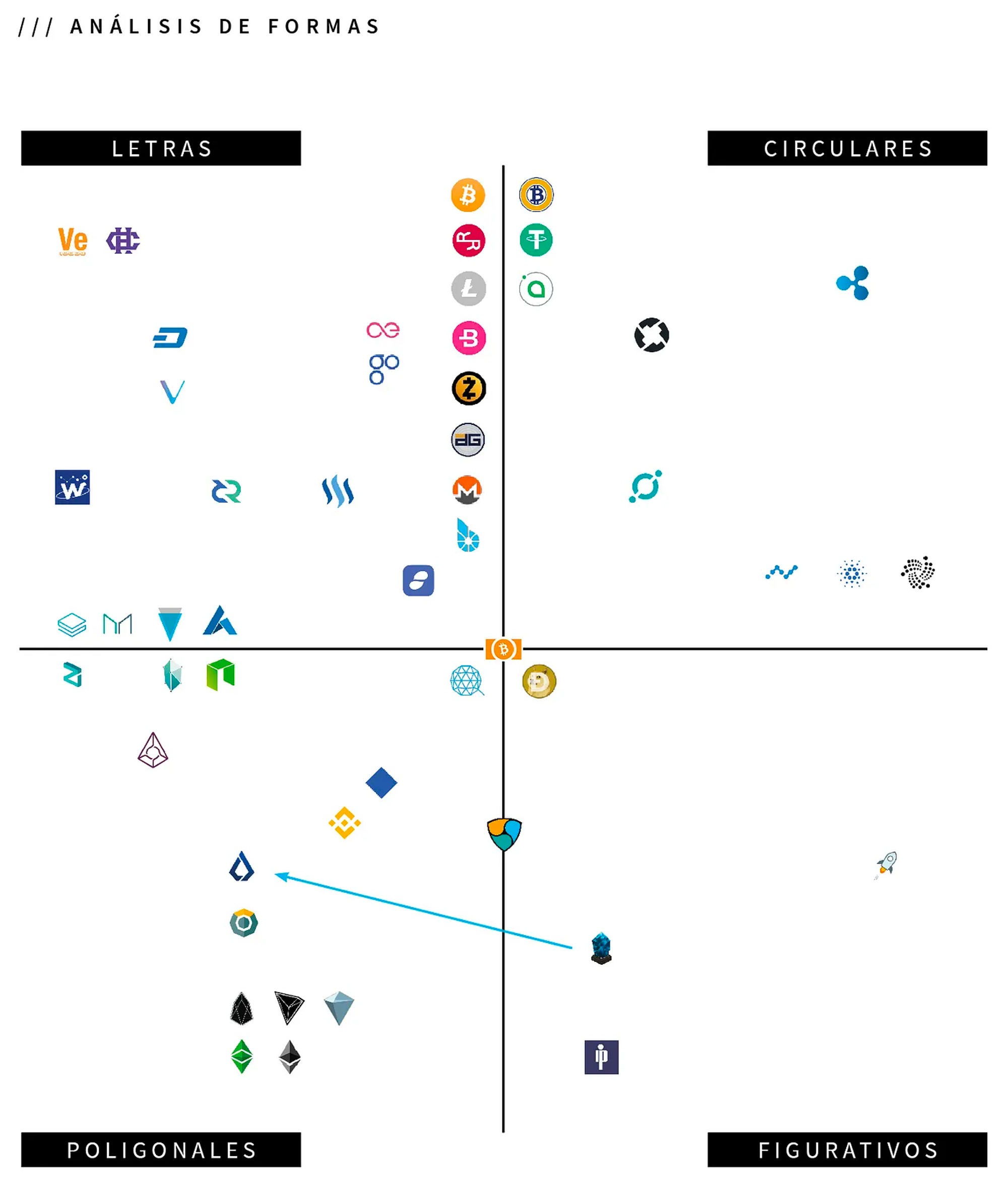
The circular group is the majority, closely followed by the use of the initial letter or parts of the name. The polygonal group, particularly hexagons, is gaining popularity in the blockchain ecosystem, perhaps due to its connection with nature, efficiency, or the word 'block.'
The figurative symbols are less used but offer significant opportunities for uniqueness and recognition. This technique is less explored in the technological field and thus poses the greatest challenge in icon design.
Combining Resources
A special mention goes to Bitcoin Cash, which combines all four resources: circular shape, the letter "B", polygonal form with a square, and a figurative element, a bill. This complete work is inspired by Bitcoin but strives for its own identity.

It's fascinating to see the diversified and classified leading projects in blockchain technology. This constantly evolving ecosystem has undergone several restylings and rebrandings, aiming to improve synthesis and seek new positioning more aligned with their objectives. Hence, the importance of synthesizing ideas in the smallest space possible with good pixel resolution.
The latest rebranding in the cryptosphere: Lisk
During the writing of this article, Lisk's new rebranding and symbol were introduced, marking another significant change in its identity.